The Kate Text Editor - UI Improvements
In the last few weeks we had time to nicely improve the general UI of our editor.
Naturally, the overall structure of the main window stays the same, with a central splitter area and some tool views around.
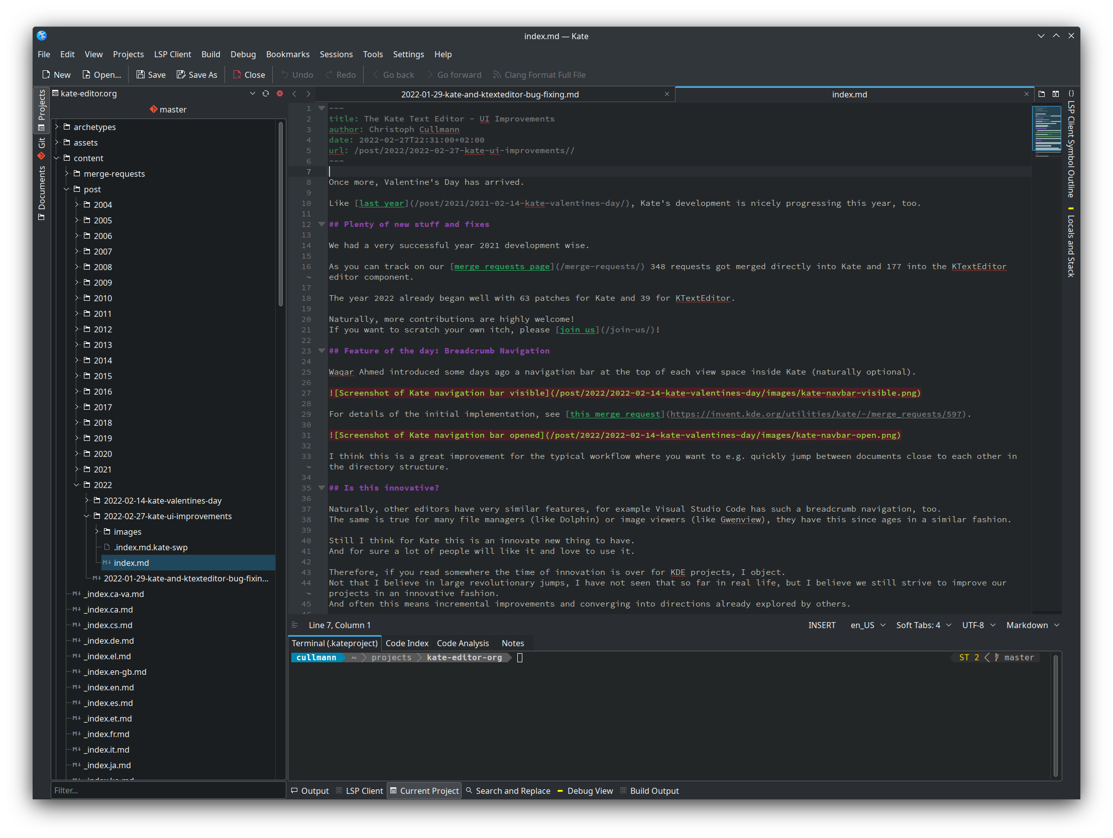
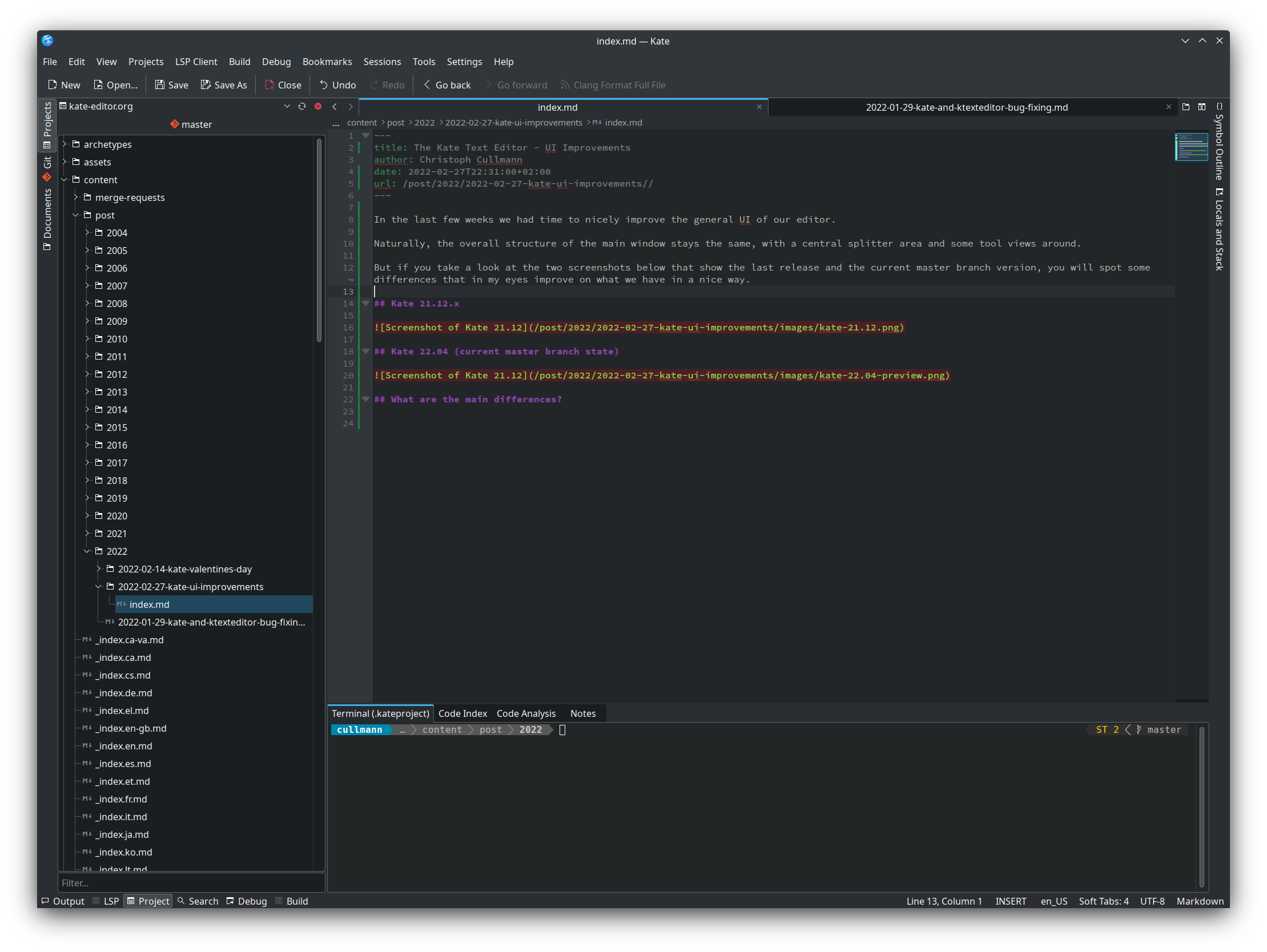
But if you take a look at the two screenshots below that show the last release and the current master branch version, you will spot some differences that in my eyes improve on what we have in a nice way.
Kate 21.12.x

Kate 22.04 (current master branch state)

What are the main differences?
URL bar
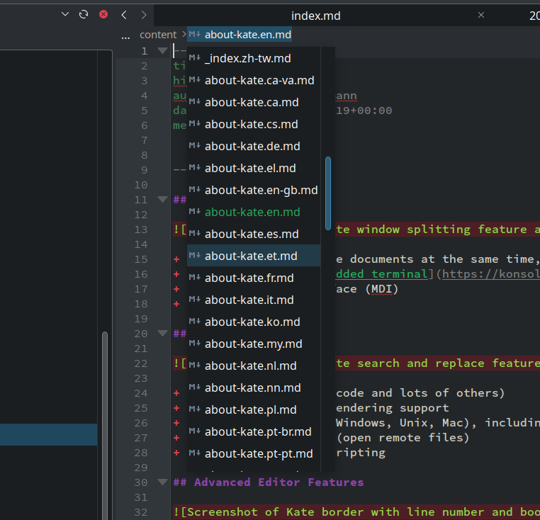
Above the view, you now have some URL bar that allows for easy switching between different files that are close to each other in the file system.

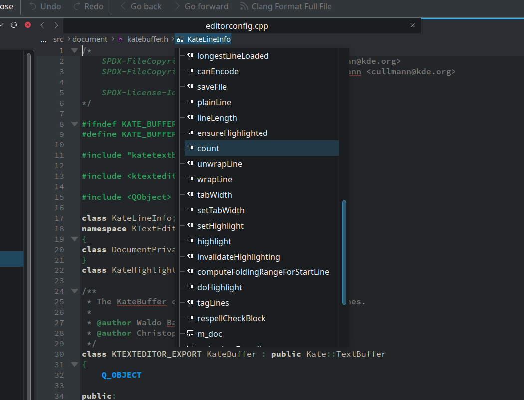
Compared to the initial post about this feature, now with LSP working, this even includes symbols for the current file as can be seen below.

Naturally, as this is the first version, there is still room for improvements to this UI element.
Unified bottom row for tool views and status bar
Unlike in 21.12, where you had the status bar of the view inside the central area, it is now combined with the tool view button area at the bottom of your windows.
This ensures the status bar is always at the bottom even if you have some tool view open.
To ensure maximal space is available, this bottom row now spans the full window width.

We tried to minimize the size of the individual elements, too.
The tool view titles got shortened and the status bar content got left aligned to have some better visual separation.
More to come?
This for sure are not the only changes coming for the next 22.04 release.
The monthly statistics for merge requests show that we have a good stream of stuff coming in.
- February 2022 (89 requests)
- January 2022 (66 requests)
Naturally not all stuff is a new feature, but there are nice bug fixes, too.
We got even some work done on the macOS platform, nice to see that people start to care about that, too!
Thanks to everybody who contributes, each contribution is valuable!
I hope more people step up and join.
As can be seen in the merge requests, not each change is a big endeavor, but it can make a big difference for our users!
Comments?
A matching thread for this can be found here on r/KDE.