Let's welcome Kate the Cyber Woodpecker
A lot of good things happen at the moment in Kate's development.
We didn't only implement plenty of new features for 21.04 and fix a lot of bugs in the last months and year, we did improve our overall product branding, too.
Early in 2020, we introduced a new Kate icon designed by Tyson Tan to get some icon that is instantly recognizable compared to the generic ones we used in the past.

Naturally this was not without controversy, but it seems to be well perceived in general ;=)
Beside this, our web site got a major overhaul, now using Hugo and the common KDE styling.
We even have now proper i18n support for the web site content using the normal KDE i18n infrastructure for translations, as done for other KDE sites. I hope this allows more people all over the world to enjoy our web presence.
Now, all this stuff leads to the topic of this post, Kate's mascot.
Given that Tyson Tan helped out with the new icon in 2020, naturally another of our branding assets that could receive an update was our mascot.
Therefore I pinged Tyson if he can give that some love, too, after the icon redesign was finalized :=)
A bit of history about Kate's mascot
2011 - The first (failed) try
Nearly ten years ago there was the first idea to have some mascot for our editor. Nothing much happened after that initial call and the topic was ignored for some years.
The whole approach for the outreach to people to design it was not that clever, just some random blog post on our homepage and then some not that helpful feedback in the comments as back channel. I think we didn't even link that somewhere else ourself at any community where a larger base of artists could have found it at all.
2014 - Kate the Woodpecker
In 2014 I had again the motivation to take a look at this. This time I didn't write some blog but directly reached out to Tyson Tan, the creator of the Krita mascot Kiki. I really liked that mascot and thought it would be awesome to have something in a similar art style for Kate. Some months later, Kate the Woodpecker was born.
The short design summary by Tyson at that time was:
Why a woodpecker? I said I was going to draw a humming bird, but she turned out to look more like a woodpecker, and the sound a woodpecker makes knocking on a tree is coincidentally similar to the sound of keyboard strokes).
Kate is female because of her name. I thought about other names like Klicky and Katherine, but I would rather save them for other future KDE projects to pick up as their names.
Design elements: “{}” on the chest, “/” of the feathers, and “*” in the eyes. The wing feathers also resembles multiple document tabs. Color scheme inspired by doxygen source code highlighting.
Now if you compare the style of this with the overall polish our branding got in the last year, it seemed a refresh for the mascot would really be great.
Let's welcome...
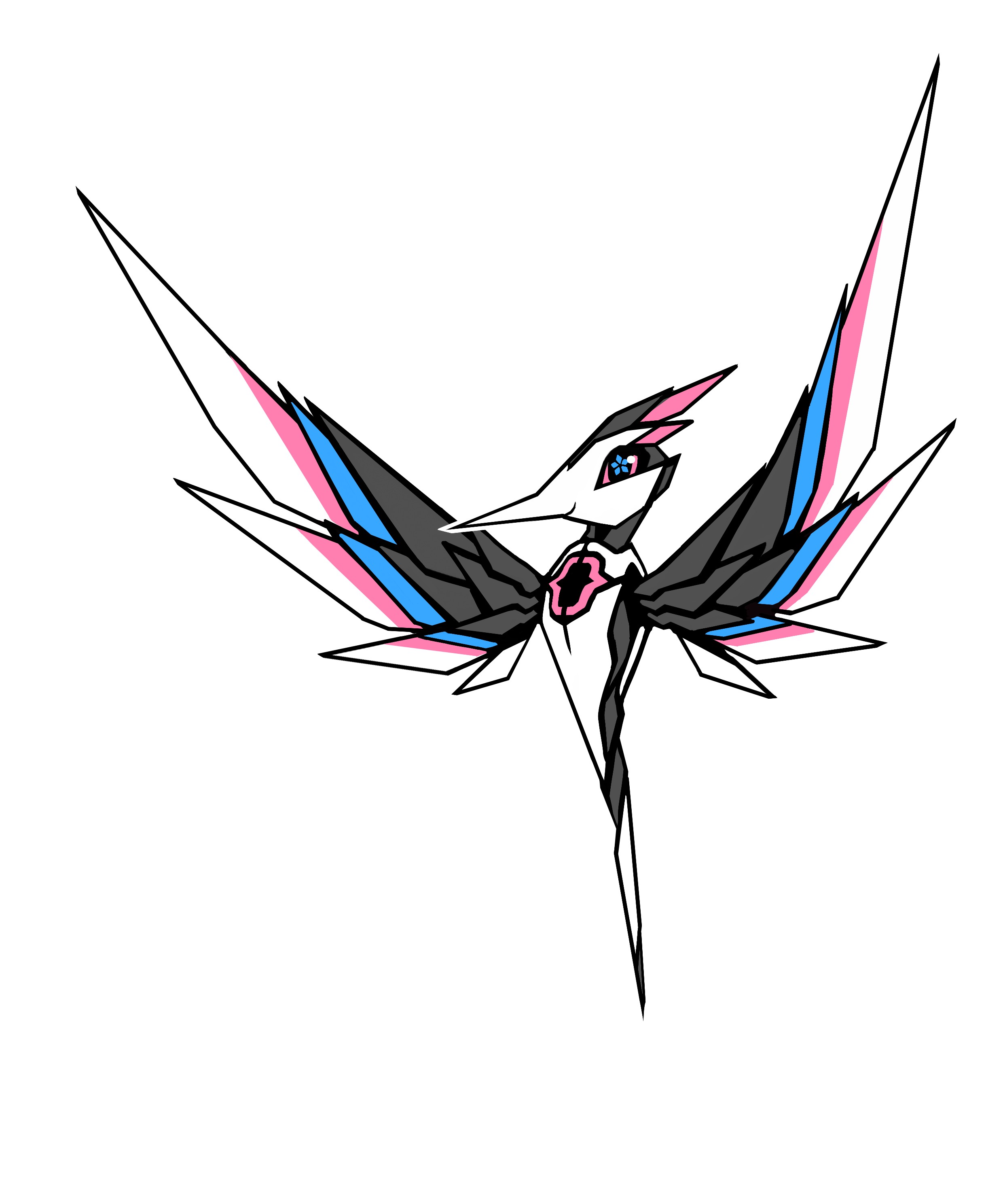
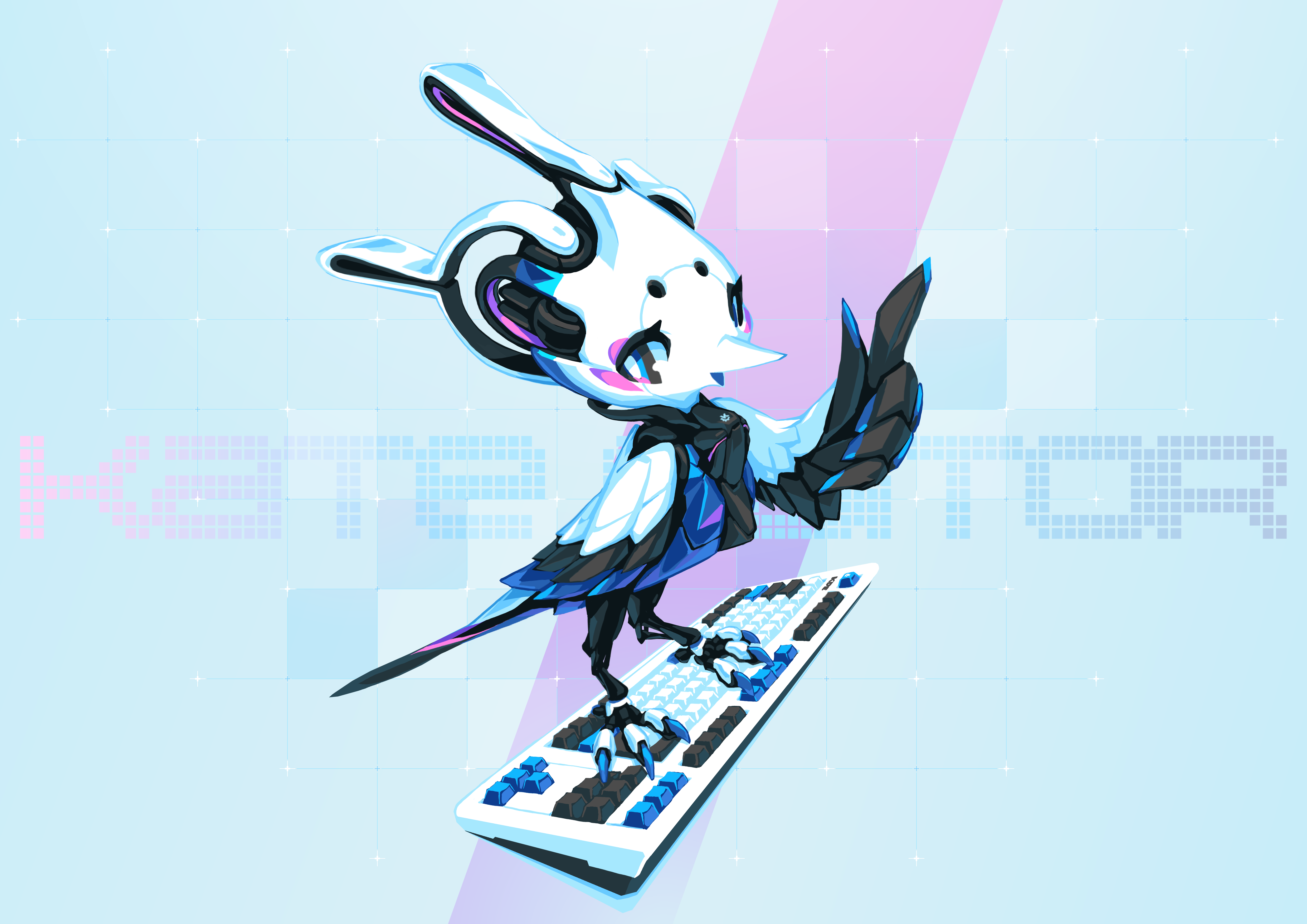
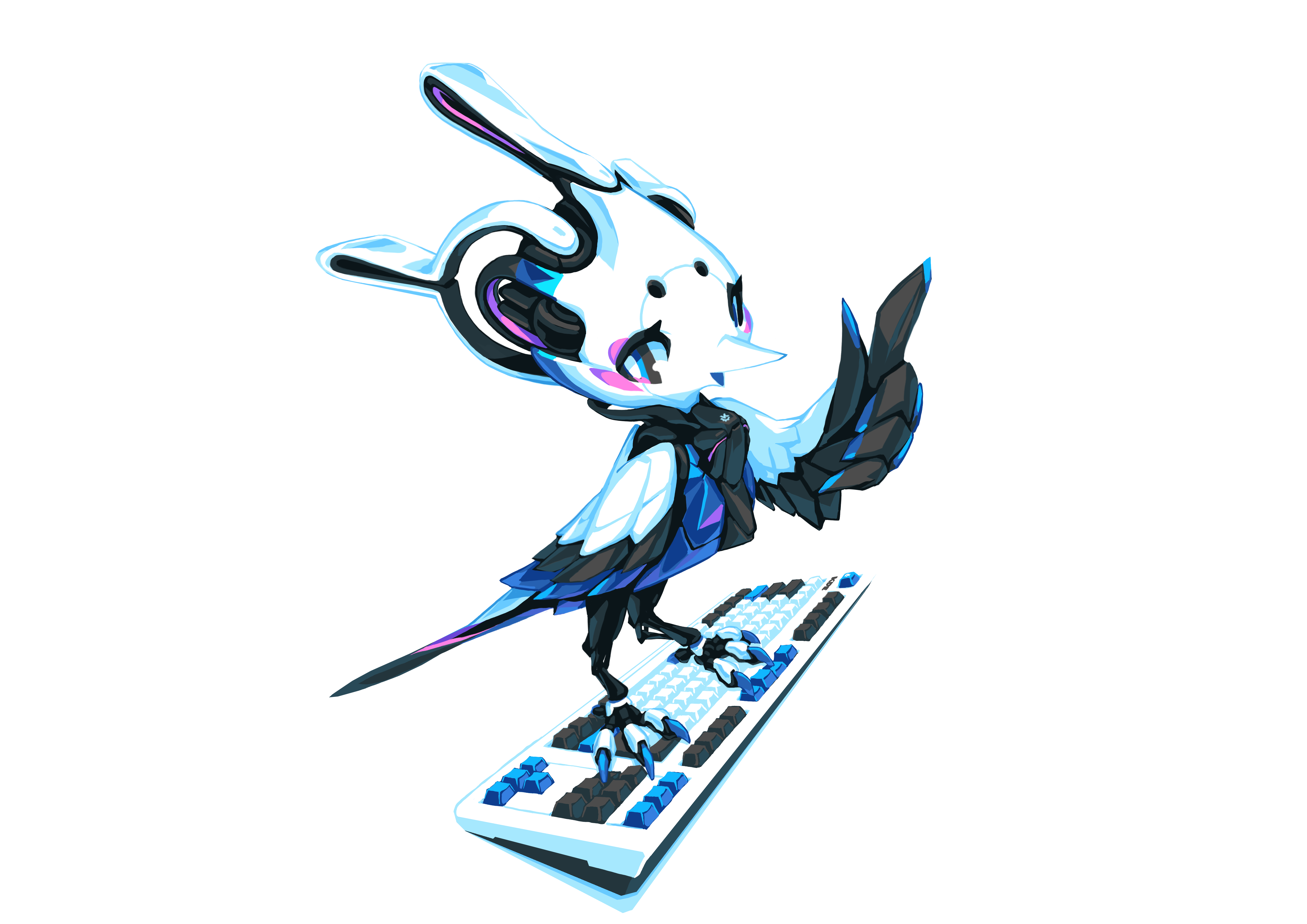
Therefore, without further delay, let's reveal the new and improved Kate the Cyber Woodpecker mascot.
Kate the Cyber Woodpecker

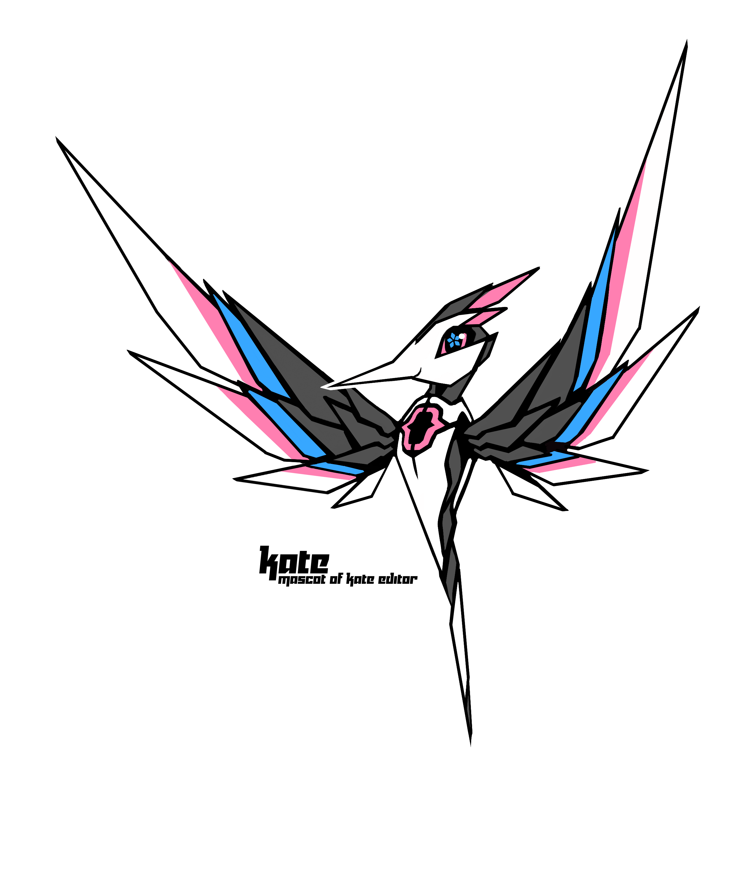
Kate the Cyber Woodpecker - Without text
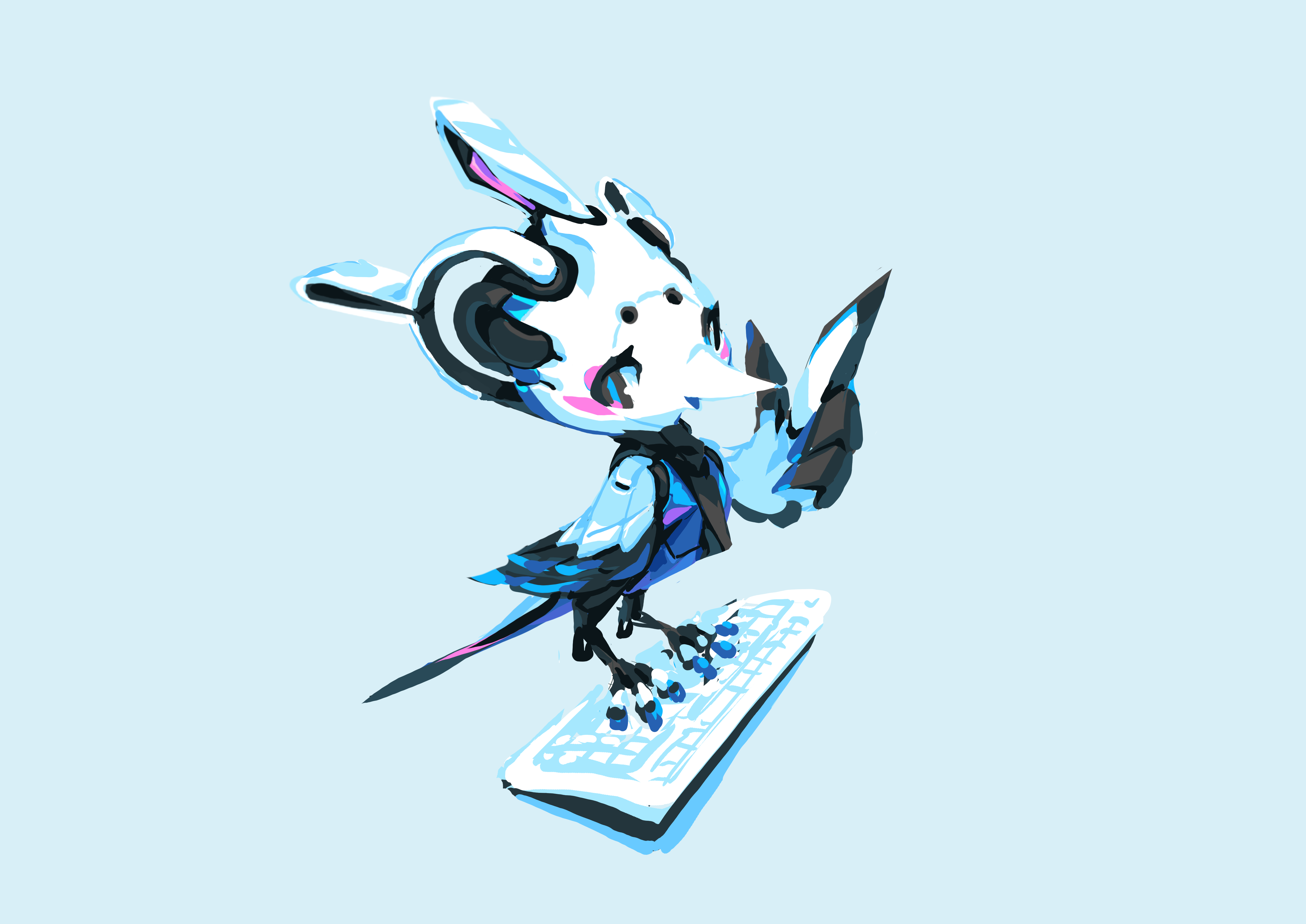
Kate the Cyber Woodpecker - Without background
;=) I am personally VERY happy with this updated design.
Tyson did really put a lot of effort into this, thanks a lot!
For the licensing, to quote Tyson:
I hereby donate the new Kate the Cyber Woodpecker to Kate Editor project. The artworks are dual licensed under LGPL (or whatever the same as Kate Editor) and Creative Commons BY-SA. In this way you don't need to ask me for permission before using/modifying the mascot.
Naturally we will use this mascot in a lot of places to promote Kate. We encourage others to do the same.
You want to print some cool Kate t-shirts? Be our guest ;=)
You want to create variations of this? Feel free! But it would be nice if you could drop us some link e.g. on our development list kwrite-devel@kde.org, that way we can re-use such things, too.
For future references, we have a dedicated page for our mascot.
Kate the Cyber Woodpecker's design history
I asked Tyson if I can share the intermediate versions we exchanged to show the evolution and he agreed and even wrote some short summaries about the individual steps. This includes the initial mascot and the icon that fit into this design evolution. I therefore just quote what he wrote about the different steps below.
2014 - Kate the Woodpecker
The 2014 version was done perhaps during my lowest point as an artist. I had not been drawing much in years, and was on the verge of giving up completely. There were some interesting ideas in this version, namely the {} brackets on her chest, and the color scheme inspired by doxygen code highlighting. However, the execution was very simplistic -- at that time, I deliberately stop using any fancy techniques to expose my inadequate base skills. In the followed years, I would be going through an arduous process to rebuild my broken, self-taught art foundation from the ground up. I'm grateful that the Kate team still kept this one on their website for many years.
2020 - The new Kate icon
The new Kate icon was the only time I attempted real vector art. It was at that time I began to develop some faint artistic sense. I had no previous experience of icon design, there was zero discipline like math-guided proportion. Every shape and curve was tweaked using my instinct as an artist. The concept was very simple: it's a bird shaped like the letter "K", and it has to be sharp. The bird was chunkier until Christoph pointed it out, I later turned it into a more sleek shape.
2021 - Mascot sketch
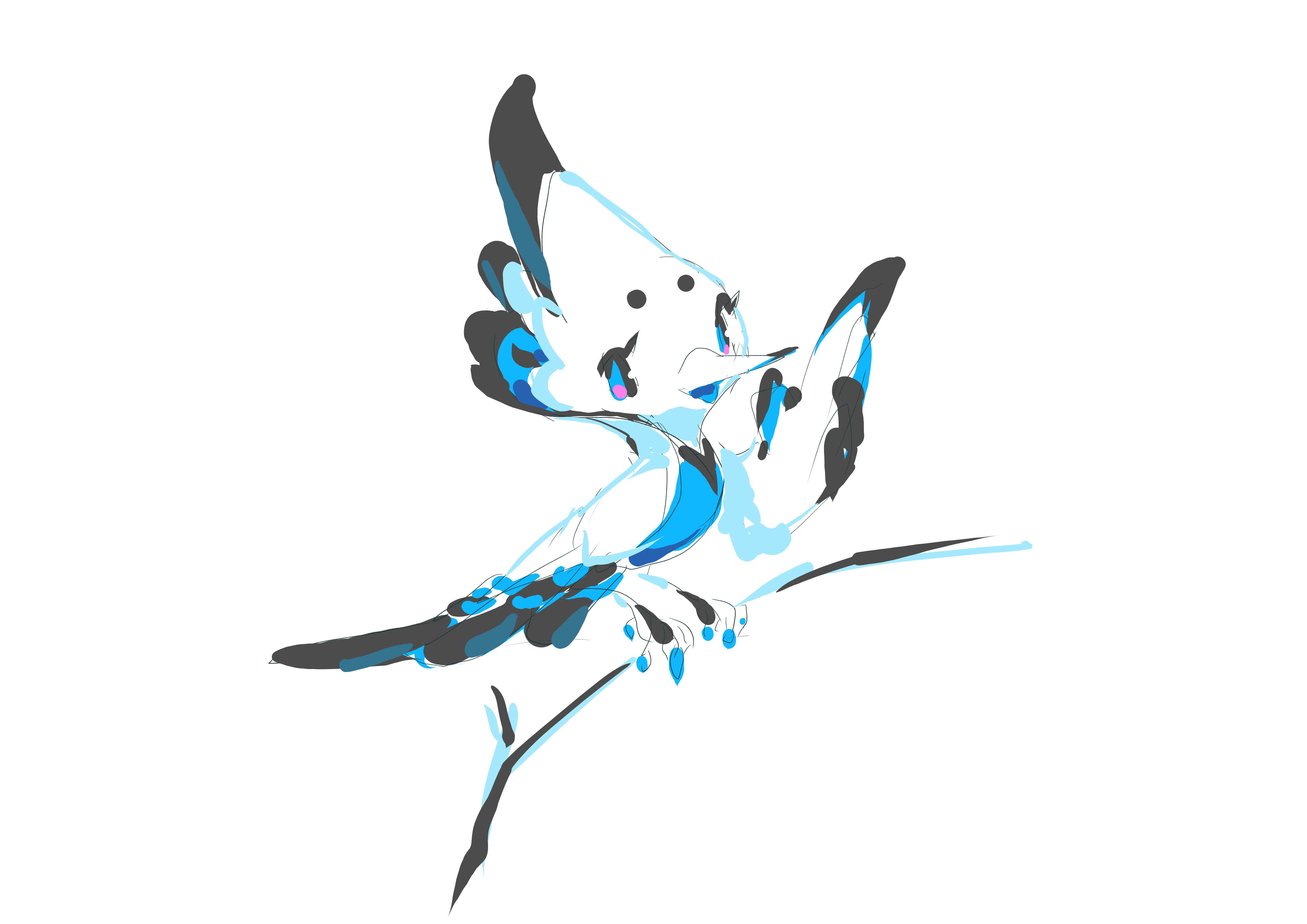
In this initial sketch, I was tempted to ditch the robotic concept and just draw a cute good looking bird instead.
2021 - Mascot design
Kate's mascot re-design resumed after I finished drawing the new splash picture for the upcoming Krita 5.0. I was able to push myself to do more each time I attempted a new picture at that time, so I was determined to keep the robotic concept. Although the proportion was off, the mech design elements was more or less coined in this one.
2021 - Final Mascot
The proportion was adjusted after Christoph pointed it out. The pose was adjusted to feel more comfortable. The wings were re-drawn after studying on real bird wings. A cool-looking, detailed keyboard was hand-drawn to emphasize the main usage of the application. An abstract background was added with a proper 2D typography design. The general idea is: unmistakably cutting edge and artificial, but also unmistakably full of life and humanity.
Comments?
A matching thread for this can be found here on r/KDE.