Kate and the Tab Bar - Release 20.12
A tab bar, that's easy, isn't it?
You would think so... But this topic seems like an everlasting journey ;=) Or running in circles...
A bit of history
The evil past without tabbing (long long ago, far far away...)
Kate did a long time not have tabbing. My initial design was a MDI editor with a list/treeview for the file selection.
We had splitting very soon and some when in-between we had tabs around the split areas (like in good old Konqueror). But we had no tabs for documents. The tabbing for the split views was removed again later, as close to nobody understood or even found it ;)
Here is some good old Kate, (alias Kant) screenshot from the good old KDE 2.2 times.
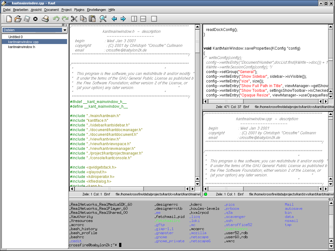
As you can see, that is the ancient past. We used CVS, the Real Player was a thing on Linux (I think I had some 'The Secret of Blue Water' soundtrack as rm files) and I was young and friendly and added nicknames everywhere to my copyrights.
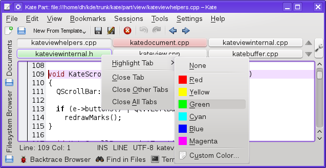
The good old times with different tabbing variants (KDE4 based Kate)
The KDE4 versions of Kate had two plugins to handle tabbing documents. No joke, we had more than one for that ;=) I have actually no real memory how they behaved, my cloudy memory just tells me "like some tab bar". But yes, there were differences that made it worth to have two plugins doing this, as nobody had the time to unite them. For people interested, this commit removed them.
Below both variants that were available in action.
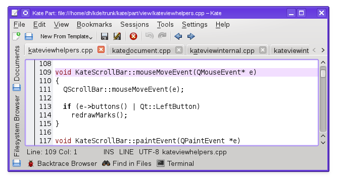
I must confess, I can't remember if I ever really enabled them on my normal installation for anything beside a short test.
The initial KDE Frameworks 5 base Kate versions - LRU is cool
During the Kate/KDevelop/Skanlite Sprint in 2014, we implemented the tab bar as used in Kate up to and including the 20.04 release. Or more precise, Dominik implemented it and I raged around about how cool LRU is. That I work on static analyses for cache replacement policies might have had some influence...
This tab bar shows the documents you are working on in a least recently used (LRU) fashion. It only shows as many tabs as fit into the tab bar, since we want to avoid horizonal scrolling (it does not scale). If not all documents fit into the tab bar, just use the Documents tab on the left, or the quick open icon in the view space tab bar bar on the right to to launch quick open.
Here some slightly later screenshot from after Akademy 2014. Looks already more or less like we kept it up to 2020.
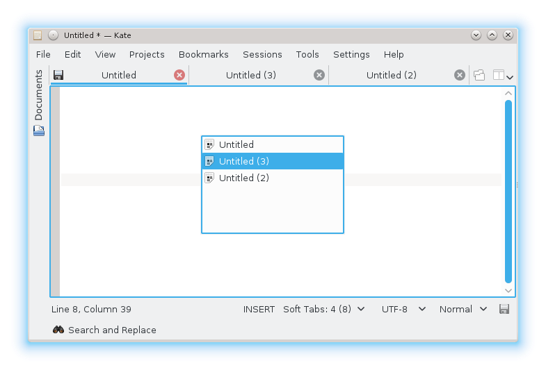
Dominik further fine-tuned that over the year, the styling got even closer to a normal tab bar and tabs got movable.
This is the tab bar variant I actually really start to use. Perhaps because it was "default" on and I liked the LRU behavior.
Kate 20.08 - the return of the "normal" tabbing
Whereas some people seemed to be happy with the LRU tabbing, we got on the other side a lot complaints about it in bugs and other feedback. For many people, it was just to alien compared to the tabbing you have close to everywhere else.
If more users liked it the LRU variant than not is hard to tell, as we normally get only feedback that is "negative". Unhappy users are unfortunately in most cases more eager to send some mail (or file a bug, why would you file one, if you are happy with the behaved...)
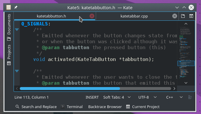
Tomaz stepped up in this merge request to rectify the situation and port our tabbing to a generic QTabBar based version. Beside solving some minor styling issues, this provides a more "common" tabbing like people are used from their browser.
I was ok with this and we merged this before the Kate 20.08 release.
And then we were happy forever... Or not..
Kate 20.12 - the return of LRU, yes really, it is back, but optionally
As we thought, not all people were completely happy with the new behavior.
I already noticed during my own work (I normally use some Manjaro Linux with the default installed Kate version for my daily work) that the normal tabbing sometimes is lacking, if you are used to LRU and now the most recently used stuff isn't staying visible, but you have more or less just the open order in the tab bar and are scrolling around a lot during switching.
The same issue got expressed in multiple bug reports.
Therefore, I re-implemented the LRU behavior, but still using the current QTabBar implementation and no custom widget. And this is now optional, default off, you can just configure some limit for the number of tabs you want to have. As long as you set no limit, the normal tabbing behavior will be used, if you set some limit, the old LRU algorithm is used.
See this merge request for the concrete code changes.
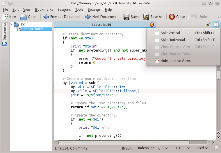
No screenshot here, as it just looks 1:1 the same as the above 20.08 screenshot, just the number of tabs is limited and they are replaced instead of the scrolling arrows you have otherwise. This is actually a feature, as the slightly different styling was one of the issues fixed with the 20.08 change.
Is this now the end? I guess or hope not, as there is never the "final" fix or solution for anything that is still in active use. And I hope Kate stays in active use.
But I think, Kate 20.12 will have the best of both worlds.
For the average user, the default tabbing behavior is just like they know it from e.g. their browser. My change should not affect this use case at all, zero behavior changes.
For people like me, they can switch over to the LRU behavior (and now even configure how many LRU tabs they want to have visible).
But hey, I want to have...
You have more needs for tabbing or other stuff? You can code? Show up and provide some patch to us on our GitLab instance.
If you have feedback on this post, use this thread on reddit.