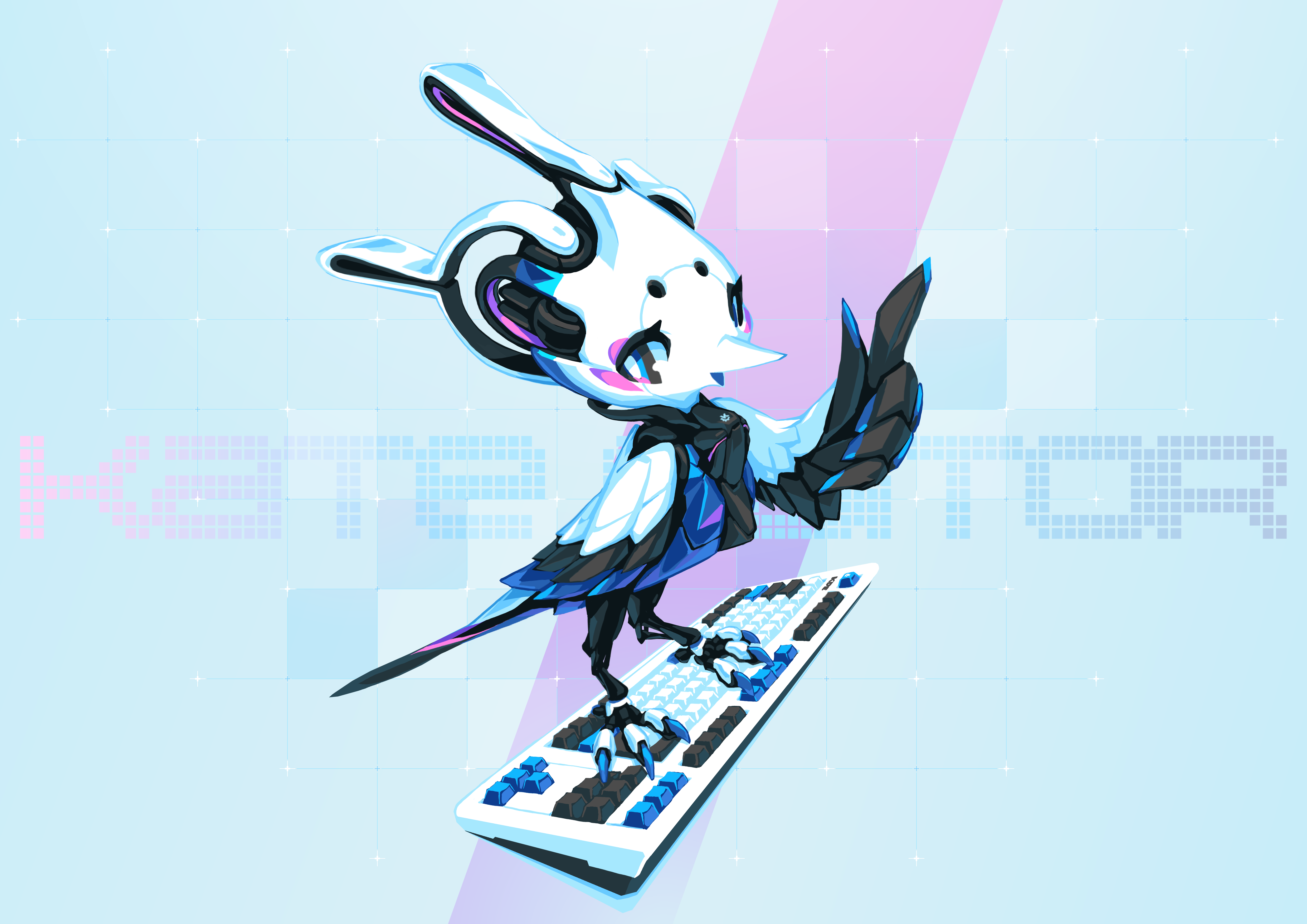
הקמע של Kate
הקמע של Kate, Kate הנקר הקיברנטי, עוצב על ידי טייסון טן.
ההתפתחות הנוכחית של הקמע שלנו נחשפה לראשונה באפריל 2021.
Kate הנקר הקיברנטי

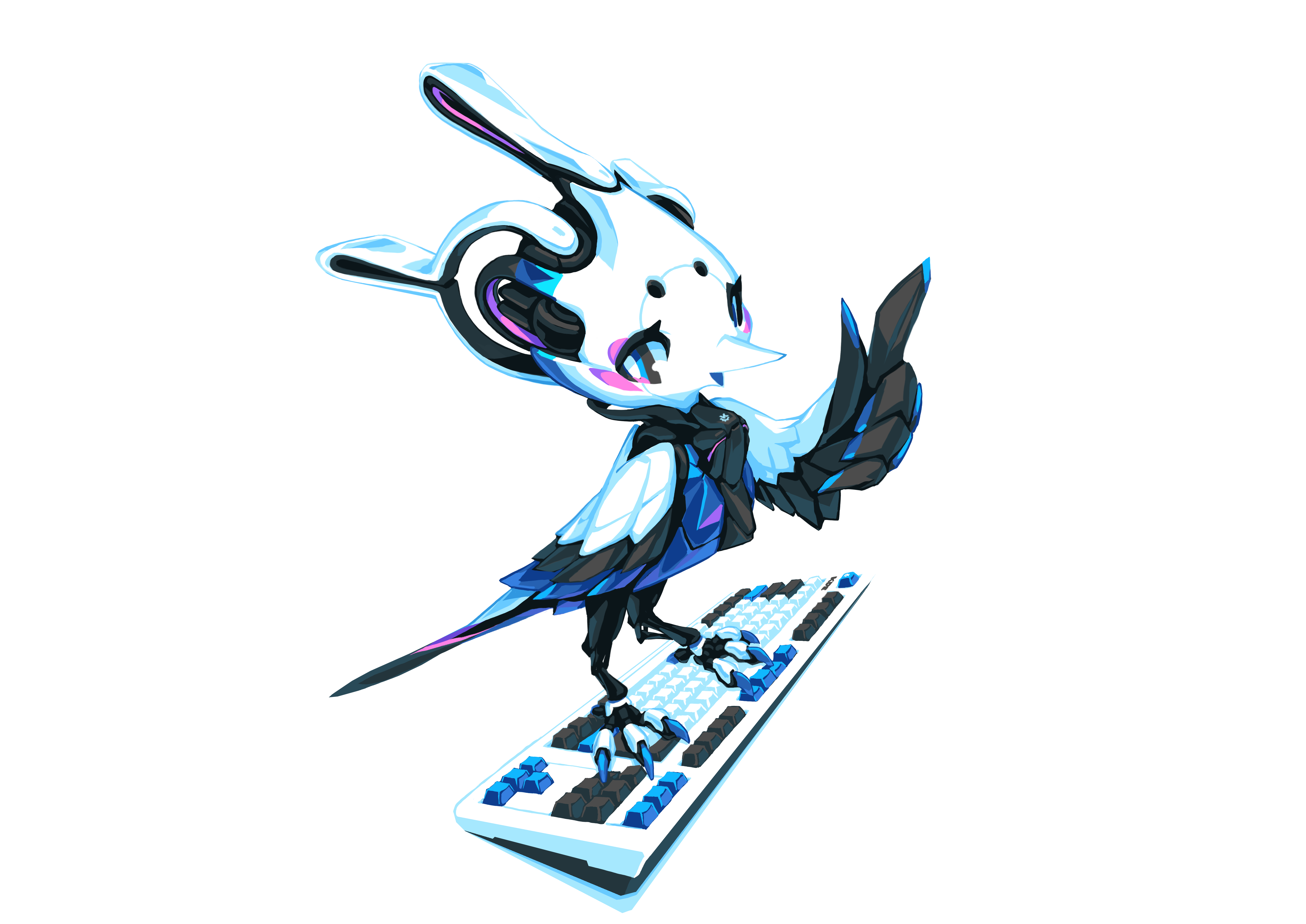
גרסה ללא כיתוב תחתי
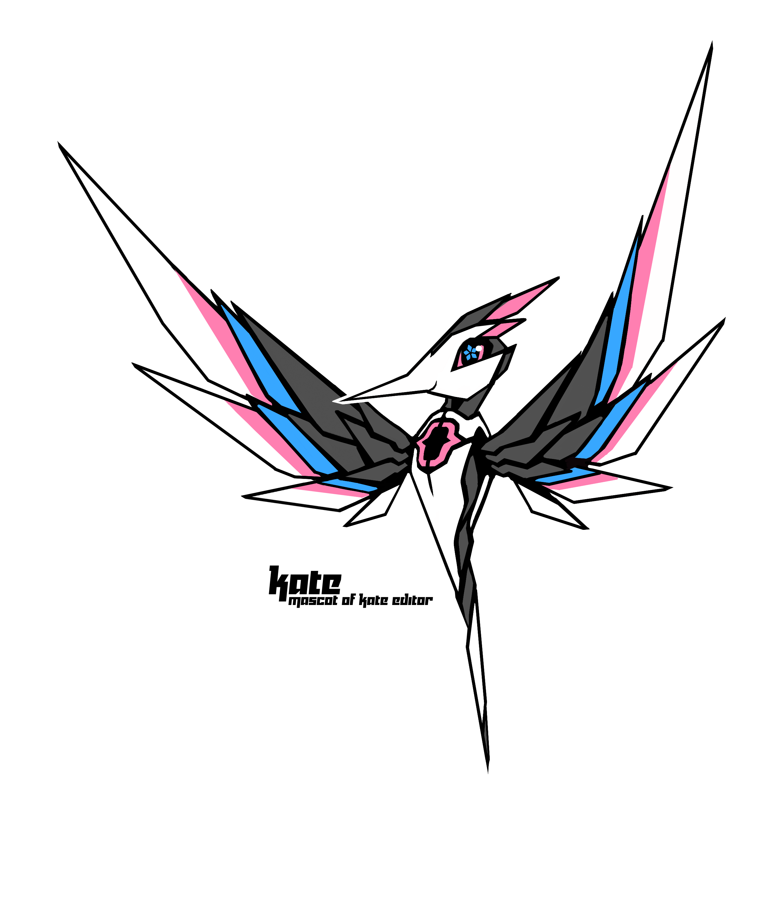
גרסה ללא רקע
רישוי
בנוגע לרישוי, אני מצטט את טייסון:
בזאת אני תואם את הנקר הקיברנטי Kate למיזם Kate. היצירות כפופות לרישיון כפול: LGPL (או כל רישיון אחר כמו עורך Kate) ו־Creative Commons שיתוף זהה. כך לא צריך לבקש ממני אישור בטרם שימוש/שינוי הקמע.
היסטוריית העיצוב של Kate - הנקר הקיברנטי
שאלתי את טייסון אם אפשר לשתף את גרסאות הביניים שהעברנו בינינו כדי להציג את ההתפתחות והוא הסכים ואפילו כתב תקצירים על כל שלב ושלב. כולל הקמע הראשוני והסמל שהתאים לאותה נקודה בדרך. אני רק מצטט את מה שנכתב על כל אחד מהשלבים להלן.
2014 - Kate הנקר
גרסת 2014 בוצעה בתקופה שכנראה הייתה נקודת השפל שלי כאומן. לא ציירתי שנים רבות וכמעט ויתרתי לחלוטין. היו כמה רעיונות מעניינים בגרסה הזאת, למשל {} על החזה שלה ומנעד הצבעים שהושפה מהדגשת קוד doxygen. עם זאת, הביצוע היה מאוד פשטני -- באותה העת, הפסקתי בכוונה להשתמש בטכניקות מפוארות כדי לחשוף את יכולות הבסיס הלקויות שלי. בשנים שלאחר מכן, עברתי תהליך מפרך לבנות את יסודות האומנות הפגומים שרכשתי בעצמי מההתחלה. אני אסיר תודה לצוות של Kate שהשאירו את הלוגו הזה באתר שלהם במשך שנים רבות.
2020 - הסמל החדש של Kate

הסמל החדש של Kate הייתה הפעם הראשונה שהתנסיתי בגרפיקת וקטורים. זה היה בתקופה שהתחלתי לפתח איזושהי נטייה אומנותית קלה, לא הייתה משמעת כמו יחס עם אילוצים מתמטיים. כל צורה ועיקול התעצב לפי החוש האומנותי שלי. העקרון היה מאוד פשוט: זאת ציפור שמעוצבת כמו האות „K”, והיא חייבת להיות חדה. הציפור הייתה קצת גסה מדי עד שקריסטוף העיר לי על כך, לאחר מכן הצורה הפכה למשהו יותר עדין.
2021 - איור ראשוני של הקמע
באיור הראשוני הזה, ניסיתי לנטוש את העיקרון הרובונטו ופשוט לצייר ציפור שנראית חמודה במקום.
2021 - עיצוב קמע
העיצוב המחודש של הקמע של Kate המשיך לאחר שסיימתי לצייר את תמונת קבלת הפנים החדשה ל־Krita 5.0 שעמדה לצאת. הצלחתי לדחוף את עצמי לעשות קצת יותר בכל פעם שניסיתי לעצב תמונה חדשה באותה התקופה, לכן הייתי נחוש לשמור על העיקרון הרובוטי. למרות שהיחסים קצת חרגו, רכיבי העיצוב המכני היו פחות או יותר טבועים בעיצוב הזה.
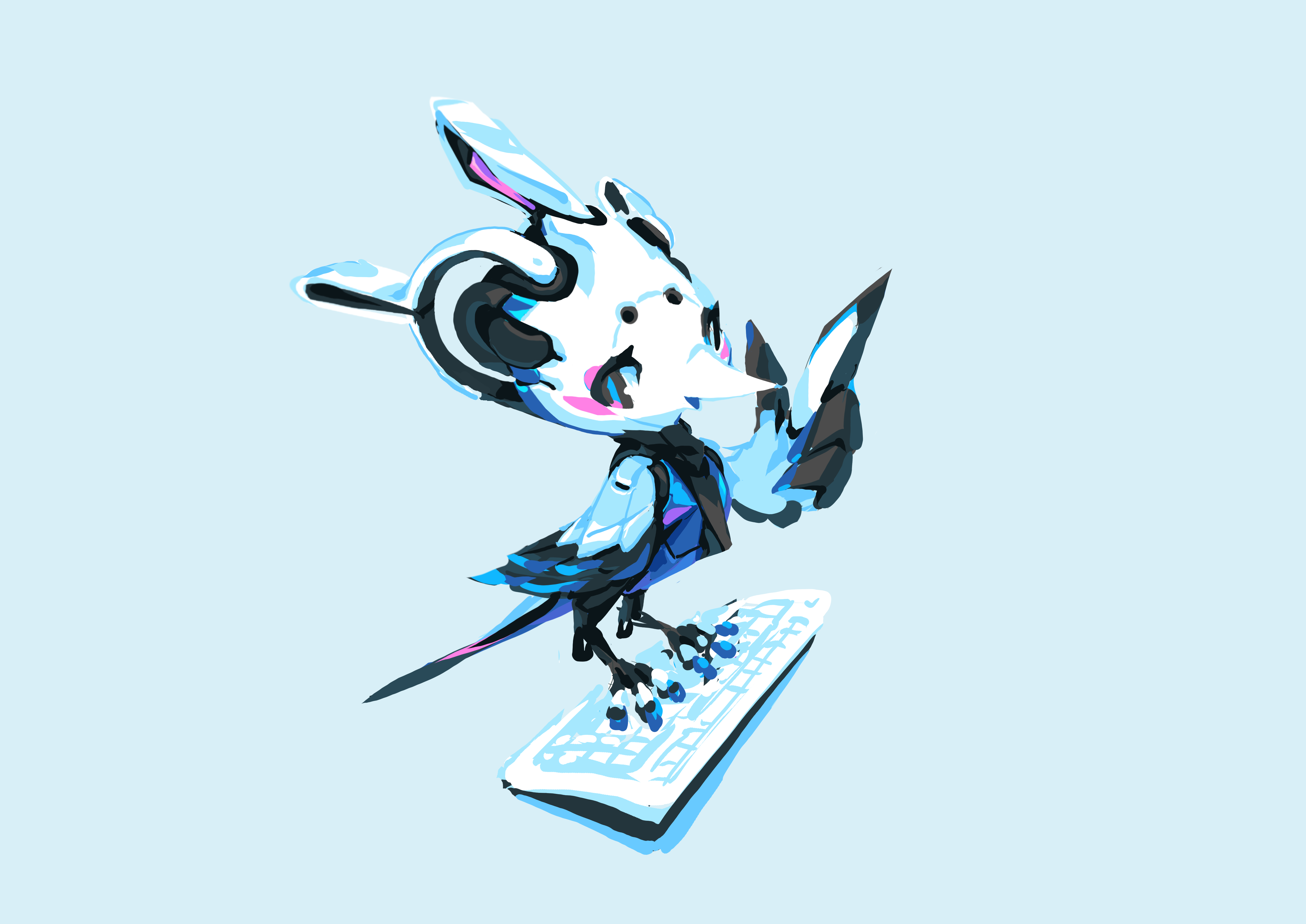
2021 - הקמע הסופי
The proportion was adjusted after Christoph pointed it out. The pose was adjusted to feel more comfortable. The wings were re-drawn after studying on real bird wings. A cool-looking, detailed keyboard was hand-drawn to emphasize the main usage of the application. An abstract background was added with a proper 2D typography design. The general idea is: unmistakably cutting edge and artificial, but also unmistakably full of life and humanity.