Good Morning Kate – New Day, New Design
Kate has since more than one year a new WordPress powered site. During last years Akademy, Dominik and I installed it and filled it with first life.
It replaced the old Drupal powered site, that Anders did set up years ago. Thanks again to Anders here, for the work he did on the old page. But since the day Anders didn’t have that much time any more for Kate development, it somehow lost its drive (as Dominik an I are not at all capable to work with Drupal, whereas Anders really was an well practiced Drupal admininstrator). The current WordPress site is much more usable for us, as we know WordPress much better than Drupal. The initial import of the content of the old Drupal page was kind of painful, but most stuff was moved over even during Akademy, just some outdated howtos and faqs got purged.
Since over an year, the current page is a vibrant source of news around Kate and KDE in general. It helped to promote Kate and for example provided our GSoC students with a central place to post about their projects.
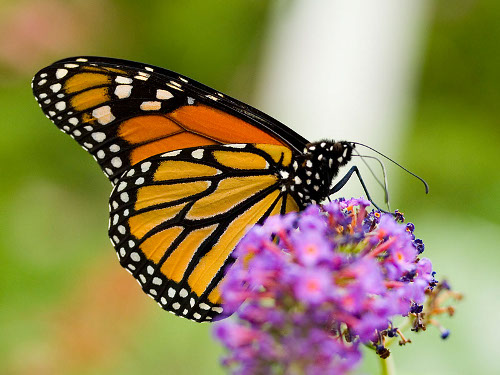
Today I was kind of bored, after being back from the Desktop Summit in Berlin, therefore I have taken a look at the design of our page (and I searched for nice eyecatcher, here a Monarch, link to german Wikipedia, as there the image was found).
As we started the page, I experimented some days with WordPress themes and finally ended using Carrington Blog. Whereas it did not really have a suitable layout for our page, its look and feel was nice and 5 lines code later, it had a for us usable one column layout.
Today I revisited the design and somehow thought why not refresh the page. After wading for several hours through “free” themes of any kind, I arrived at PressWork. Its very plain design just caught my eye. And even better, it has some nice HTML5 based interactive editor to fiddle around with stuff like sidebar placement, sizes, fonts, colors, … Nice! After a bit over a hour playing around with it, I got a kind of nifty new and fresh design going. Event without any pictures, it really is kind of elegant ;) (At least for my taste).
Therefore, all that wake up soon, here it is, kate-editor.org in a new fresh design. It is not really finished, will play a bit with colors/widgets/sizes/… around in the next days. But overall, I think it will stay that way. Lets hope for a next successful year for both my poor small editor (component) and its website!
Together with the new design, I added buttons to allow easy sharing of posts with social media of any kind (thanks to Dominik for the idea). Lets see if that keeps even more readers rolling in here. Spread the work. We both want a lot more users and a lot more contributors (and yes, I count documentation writers, usability guys and others in, not only developers).
Thanks to all contributors, keep rocking!
Now: good night, or better, good morning!
